What is the impact of color on our lives?
Color impact on life is something we often take for granted. It greatly impacts how we see art, people, and our environment. Some colors make us feel more calm, while others excite emotions. Throughout history artists, advertisers, architects, interior designers, and photographers have used these theories to impact how they make decisions in their workflow.
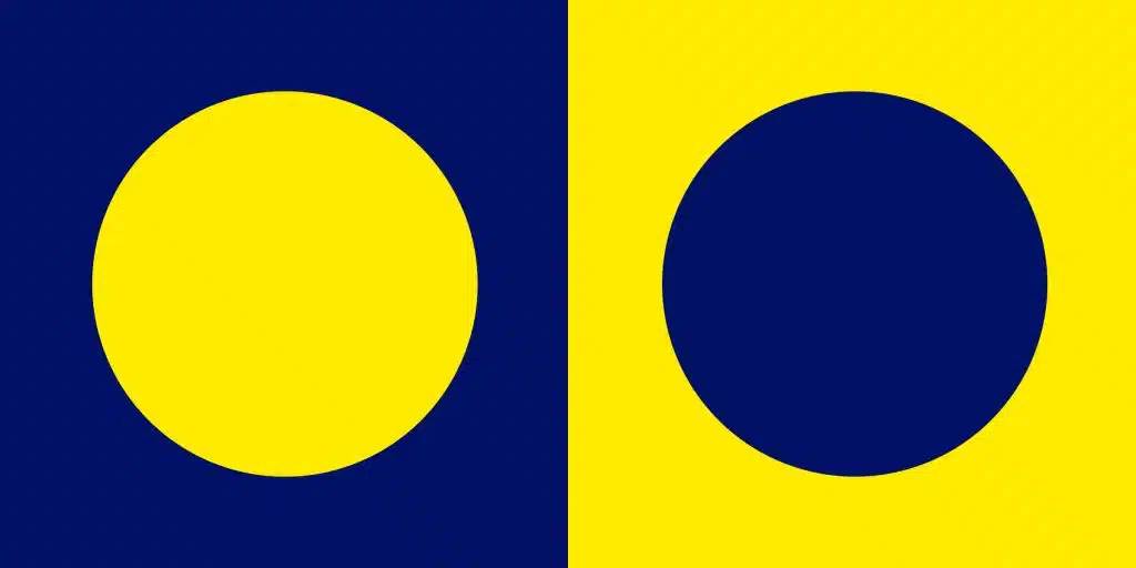
One example of how color theory is used in photography and videography to highlight subjects is the use of the way cool colors and warm colors interact with each other. For instance cool colors normally make things recede towards the background, while warm colors cause things to get visually pulled forward. As and example of this, look at the image below. For most people the blue will recede causing the the yellow circle to appear on top of the blue square, and the blue circle appears to be a hole in the yellow square.
When we understand these theories we can use them to bring focus and purpose to our work.
Color Experiment
When you look at the images below what are the differences? Are there differences in lighting, camera settings, color temperature, and post production?

The model in these photos is in a very similar pose, with only subtle differences, but this is not what make the images look so different?
The reality is that everything in these two photos is identical: camera settings; color temperature; lighting; flash position and power; and post production. With that said I think we can all agree that there is a huge difference between the two photos. They have different moods, and even the skin tone of the model is slightly different. So why does her skin look different, is it an illusion or is there and actual difference? There is an actual difference, because the light bouncing off the backdrop changes color and reflects differently on her skin. Take not of her foot in the air, the one has a tint of orange while the one on the blue is darker and had a blue undertone.
I chose these two backdrops very purposefully. The one on the left creates a complimentary color scheme, while the one on the right is monochromatic. When you look at the two images how do they make you feel? Are you drawn to on versus the other? Do you have an emotional response with one more than the other? Comment below and let me know what you think.
Planning your Session
So as we begin planning our sessions it is important to think bout color and how you want your images perceived. Do you want to create an impact or do you want to be more subtle. Do you have a specific location in your home you want these photos to hang and what are the wall colors and other themes in the room.
To book a consultation with me click on this link to give me some basic information and then I will send you link to setup a call so we can begin the process of booking your session.